
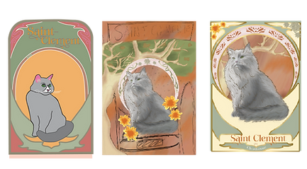
Design Brief
This wine bottle label is to honor my late Grandma. Growing up we used to visit her every summer in Santa Barbara. She lived on San Clemente St which is why I chose the same name Saint Clement, but chose to write it in French to follow the traditional Art Nouveau characteristics. I also chose to create this wine bottle inspired by Art Nouveau because of how much my grandma loved this art movement and art in general. I added a lemon tree throughout the image because as children we would spend time in her backyard under her lemon tree and make lemonade together. I also chose to incorporate chrysanthemum which were my grandma's birth flower. My grandma was also a white wine drinker and she fancied Chardonnay the most. Lastly, I chose to put a gray cat at the center of the bottle because growing up my grandma had a grey cat she loved dearly named Pepe Le Pew.


Research
For this project, I researched several art forms, but most extensively I found research and images related to the Art Nouveau movement. I found the most inspiration when viewing Alphonse Mucha's various works.


Sketches
Some of my initial ideas were inspired by memories of my grandmother. For example, I considered designing the wine label to reflect the street she lived on in Santa Barbara, San Clemente Street. I also thought about creating a logo based on her handwriting, with hummingbirds surrounding it, as she loved them. However, I ultimately felt that my Art Nouveau-inspired cat design was the strongest direction for the brand.


Digital Iterations
I created several digital iterations of my grandmother's cat, Pepe Le Pew, who I remember from my childhood. I spent a lot of time refining this design, aiming to make it align with the style of various Art Nouveau works. I incorporated light shading inspired by Mucha's pieces and used the soft brown outlines common in Art Nouveau designs. Initially, I struggled with finding the right layout for the cat illustration, but eventually, I began to piece together the label and bring the design to life.

Felgine
AaBbCcDdEeFfGgHhIiJjKkLlMmNnOoPpQqRrSsTtUuVvWwXxYyZz1234567890
Typography
I selected a typeface that I felt reflected the style of typography commonly found in Art Nouveau works.
Color Palette
I chose colors commonly seen in various other Art Nouveau posters and designs. I felt the various earthy tones complimented the final design.
#F0C6A7
#606F68
#BF7644
#8C8774
Iconography

The iconography I used was inspired by things that reminded me of my grandmother. The lemon tree illustration is based on the one in her backyard in Santa Barbara, and the chrysanthemums were included because they were her birth flowers. I also incorporated the repeating arch pattern, which I had seen in many Art Nouveau works, to add another layer of that aesthetic to the design.
Final Design

Final Mockup
