Design Brief
For this project, we were assigned to design a poster for two on-campus events: "Explore SDSU" and "Open Studios." Explore SDSU aims to spotlight the university, attract prospective students, and engage the local community. Open Studios focuses on showcasing the art department and giving attendees a chance to meet the emerging graduate student artists. Our goal was to create an eye-catching and engaging poster, along with a postcard, social media posts, and wayfinding signage to promote the events effectively.


Research
For this project we were asked to research posters we found were effective and also various posters that promoted art exhibits. I also chose to look at very posters that showed high contrast and the use of thresholds.


Sketches
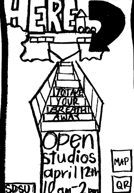
I had many ideas initially and somewhat struggled to go in one direction, but after many iterations, I chose to do the stair leading up to the art building.


Chosen Direction

Digital Iterations
For my digital iterations, I explored several directions but initially decided to focus on the iconic, steep stairs connecting parking lot 15 to the Art building. I wanted to highlight SDSU students' creativity with a touch of humor. Using my own photography, I blended the staircases with the school's architecture, incorporating high-contrast colors and vibrant complementary hues to capture attention.


Typography
For my typography I chose a Slab serif font to complement the loudness of the poster and further draw people in. My secondary font choice was a more organic and handwritten text which I felt broke up the boldness of the text and complemented the playful nature of the poster.
Color Palette
I chose very bright colors that were essentially complementary to each other to really catch someone's eye. I also wanted the colors to be inviting for prospective students and members of the community.
#F19D1F
#E63E90
#7CCCC7
#F2672B
#FFFFFF
Final Deliverables
Postcard


Social Media Post
Way-finding Signage


